20+ Trending Color Palettes for Websites That Actually Feel Modern
Ever landed on a website and instantly felt something—calm, excitement, trust—before you even scrolled?
That’s color doing its job, often before you notice it. In 2025, the best designers aren’t just following trends, they’re setting the mood and telling a story with every shade.
Color isn’t just decoration. It’s your brand’s first impression, your silent sales pitch, and the reason users stick around (or bounce in three seconds flat).
If your site’s colors feel stuck in the past, you’re missing out—on clicks, on trust, on that “wow” factor that makes people remember you.
Why Fresh Color Palettes Matter
Colors shape how people feel about your site—before they read a single word.
- They guide users, highlight what’s important, and nudge them toward action.
- Staying current isn’t just about looking trendy. It’s about proving your brand gets it—that you’re alive, relevant, and evolving.
- The right palette = more trust, more engagement, more conversions.
The 2025 Color Forecast: What’s Actually Trending (And Why It Works)
Here’s a designer-approved list of palettes you’ll see everywhere this year—each with a quick breakdown so you know where and how to use them for max effect.
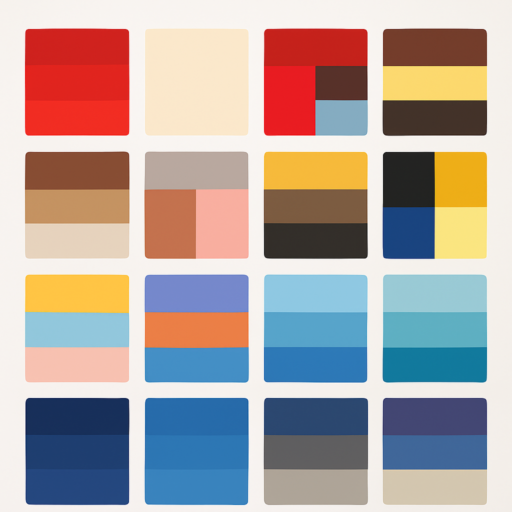
1. Monochromatic Red
All reds, all in. Use bold, varying shades for drama and energy—perfect for brands that want passion, urgency, or attention-grabbing buttons.
2. Red Accents
Keep your site chill, but let red do the talking on calls-to-action, links, or icons. Instant pop, zero overwhelm.
3. Red, Mahogany & Blue
Modern but grounded. Red energizes, mahogany warms, blue calms. This palette says “trust us—but we’re not boring.”
4. Maroon & Buttercream
Rich, inviting, and a bit luxurious. Ideal for boutiques or anyone wanting cozy vibes with a polished edge.
5. Espresso & Sunshine
Deep brown meets bright yellow. Feels like a morning coffee in the sun—warm, optimistic, and full of energy.
6. Chestnut, Tan & Pearl
Earthy, minimal, and sophisticated. If your brand values authenticity or sustainability, this is a natural fit.
7. Wenge & Limestone
Minimalist contrast—dark wood meets cool stone. Understated, modern, and quietly confident.
8. Clay & Blush
Earthy reds + gentle pinks = warm, creative, approachable. Great for lifestyle brands or creative studios.
9. Mustard, Tawny & Linen
Retro yet modern. Vintage warmth and softness—makes any site feel handcrafted.
10. Black & Yellow
High contrast, high impact. Black says “serious,” yellow says “look here!”—perfect for startups or creative agencies.
11. Blue & Yellow
Timeless combo for trust and optimism. Works in almost any setting, from health to education.
12. Pastel Blue, Yellow & Pink
Soft, inviting, and super approachable. Use for wellness, kids’ brands, or anywhere you want a light, modern touch.
13. Coachella Sunset Orange, Periwinkle & Teal
Festival energy. Orange pops, periwinkle soothes, teal grounds. Built for bold, creative brands.
14. Mandarin, Blue & Mauve
Energetic meets serene. Great for beauty, wellness, or anyone looking for that perfect balance.
15. Up in the Clouds Blue
Gentle blue gradients = calm, minimal, modern. Makes meditation and productivity apps feel at home.
16. Soothing Blue & Buttercream
Trustworthy and warm. Healthcare, hospitality, or anyone aiming for professional but friendly.
17. Midnight & Blue Bird
Deep navy + electric blue. Sophisticated, but with a spark. Tech and luxury brands, take note.
18. Blue on Blue
Layered shades of blue create depth and consistency. Classic for finance, modern for creative portfolios.
19. Galaxy Blue & Taupe
Mysterious meets grounded. Rich blues and muted neutrals—elegant and versatile.
20. Ocean Blues
Inspired by the sea, perfect for wellness or travel. Instantly calming and universally appealing.
21. Figs & Lavender
Deep purple + gentle lavender. Luxurious, relaxing, and unforgettable—perfect for beauty and lifestyle.
22. Oysters, Sand & Fog
Coastal neutrals for a minimal, dreamy vibe. Puts content front and center, without visual noise.
Beyond the List: How Color Trends Shape the Web
Color isn’t random—it moves with the world.
- Burning Red: Passion and intensity are back. Use for bold brands.
- Neutral Ground: Calms the senses, makes bold accents shine.
- Sunny Brights: Joyful, vintage-inspired, impossible to ignore.
- Ethereal Tones: Soft, airy, and calming. Perfect for wellness and lifestyle.
- Sea to Sky: Blue gradients for trust and peace.
- Monochromatic Contrast: Depth and subtlety with a single color family.
What This Really Means
The right color palette isn’t just about what’s trendy.
It’s your shortcut to telling users what your brand feels like—before you say a word.
In 2025, color is more powerful than ever. Use it to start a conversation your audience actually wants to have.
Ready to see your brand in a new light?
Save your favorite palette, experiment, or reach out for a personalized color consultation. Make your website memorable—one color at a time.